Wonderful news! The new print issue of Domino is now on newstands! Technically it hits next week, but I found copies here in Arizona in groceries stores and at Barnes and Noble, so it should be everywhere. And guys, it's really, really good.
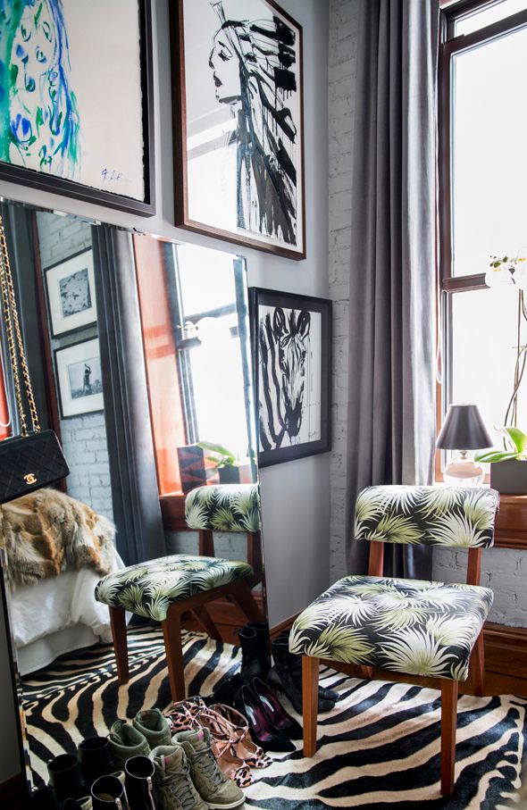
The team shared a couple of sneak peek photos with me and invited me to pass them along to you. Both of the images feature mostly neutral interiors. You all know how much I love the concept of neutral backdrops with pops of color. It's an easy recipe that works every time. Domino's Editor-in-Chief, Michelle Adams, had this to say about this artist's space:
Designers are gravitating towards pared down scandinavian-influenced interiors, using color to express their personalities. This artist, Jenna Snyder-Phillips, was influenced by her ink, oil and charcoal paintings. The neutral black and gray tones allow her art to take center stage and this sophisticated palette makes her 400 sq ft space feel grand.
And how gorgeous is this living room in the Harlem apartment of designer Ron Marvin? He was inspired by a Kravet fabric with lots of beautiful, neutral tones. I think all the textural elements in here really make this room sing!
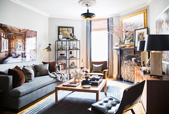
both photos by Brittany Ambridge
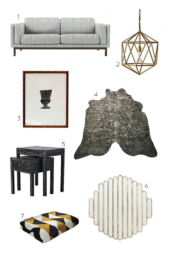
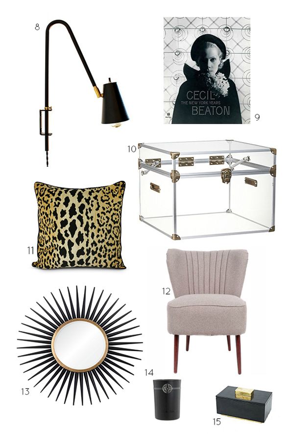
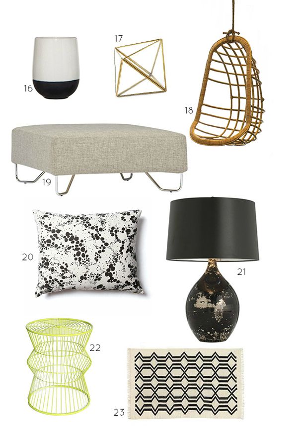
Here are some items that I'm loving in neutral tones with a similar vibe to these beautiful Domino spaces:
0 comments :
Post a Comment